Sunday, 22 February 2015

Filming Day Three

Filming Day Three:

This was the third day of filming and today we decided to get some shots which we thought were missing and the shots in which we needed to re-film in order for it to look better and clearer. 

Due to certain circumstances Jodie and Ashley couldn't be there at the beginning of the day so me and Charlotte decided to commence the filming in order to get as much done possible. The first thing we decided to do was get a long shot of Charlotte squirming under the covers as if something was irritating her and then she wakes up and covers her ears. This shot was used to tie in the whispers to the trailer and we believed this looked successful. We then decided to experiment with shots where it looked like someone was hanging over Charlotte holding the book. In order to get this shot I had to make sure that the camera was set in the correct way so that it didn't get my feet or legs in the shot and that it was low enough to just get my hair hanging over her, this took many shots to get it perfect. 

Once Jodie and Ashley arrived we decided to get the bathroom shot where Charlotte was standing behind Ashley in the mirror. In order to get this shot me and Jodie needed to work together as I held the camera over the bath screen Jodie had to tell me if you could see both Charlotte and Ashley in the mirror without the camera or us being seen which was successful after a number of time trying to get this shot. We then had to go up into the loft to try and film the shot where Charlotte jumps out at the individual who tries to take the book of her and we decided to do it in a different area which mad it look more professional. We then decided to get a shot where Charlotte was again reading the book but this time behind the banister bars which had connotations of horror and her being trapped in a possession with the devil's diary. 

After this we felt that we had all of our recordings in which we wanted to get in order for the trailer to have all the shots we needed.  

Saturday, 21 February 2015

Ancillary Task - Horror Poster Screen Shot Three

Horror Poster Screen Shot Three:

This is the last stage of my poster and this shows that I have finally added the image to the poster which I have manipulated to make the diary stand out and this makes the audience want to know its importance and makes them want to go see the film to see why its so important. Because the image is all black and white and then the diary has colour instantly draw the audiences attention which I feel was more successful than the other posters image.


Ancillary Task - Horror Poster Screen Shot Two

Horror Poster Screen Shot Two:

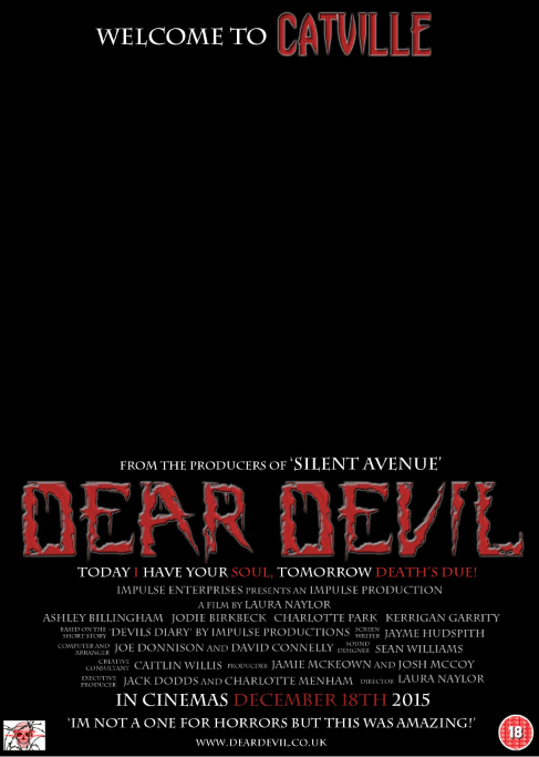
This is the next stage of my horror poster and this shows that I have added the institutional information on the bottom of the poster which is a common convention with posters as this is a way to promote the people within the film if they are known celebrities. I have also added the release date of the movie on the poster so this enables the audience to see when they can go and see the film on this day which promotes the film. There is also the website of the film on the poster so the audience can go onto this website and find out a bit more about the film and possibly get involved in the promotion of the film contributing to the promotional aspect of the film. 

Ancillary Task - Horror Poster Screen Shot One

Horror Poster Screen Shot One:

This is the beginning element of my horror poster and this show that I have put the title of the film at the top of the page which is not thought to be a common convention within horror posters as they often place them just above the institutional information making the image on the page stand out for the audience. I have also added additional information stating which other films the directors have created which allow the audience to see whether they think this film will be good. I have placed a tag line under the title which often grab the attention of the readers which make them wonder what this means and will interest them into going to see the film. I have also added the common conventions of the placing the age of the film at the bottom left hand corner of the page and I have also added our production company logo which we created to show who the production company of our film is in order to give them credit.

Friday, 20 February 2015

Ancillary Task - Second Horror Poster

This is my final horror poster after I decided to change and manipulate the layout and image within my horror poster in order for it to look a lot more professional and more like a real media horror poster. I am going to show the process of my horror poster through screen shots of different stages within my poster showing what I did at each stage

This is my final horror poster: 


Friday, 13 February 2015

Ancillary Task - Horror Poster Screen Shot Three

Horror Poster Screen Shot Three:

This is the final screen shot within the progress of my horror poster and this shows that I have added the image to the page. The image takes up the whole which is a common convention within horror posters at the image is usually the main attraction within horror poster. As you can see the image is not very clear and the writing takes over most of the page which is something that I needed to consider in order to make it look much stronger.

Ancillary Task - Horror Poster Screen Shot Two

Horror Poster Screen Shot Two:

This is the second shot of the progress of this horror poster and this shows that I have added the institutional information just under the tag line which is again a common convention within horror posters. I have then added the release date of the film which is important for horror poster and almost all horror posters will feature this on a poster for a film. There is then a recommendation at the bottom which makes the audience want to know more about the film and they will want to see for themselves if this recommendation was true. I have then added the website of the poster on the very bottom of the magazine which is again another convention on the magazine. As you can see having all this information at the bottom of the page it makes the poster look quite crowded and it might not catch the audiences attention as much which is not what I want, I want to be able to grab the readers attention more which was a weakness within this poster.